Today for Day 7 of the Machine Learning “Advent Calendar”, we continue the same approach but with a Decision Tree Classifier, the classification counterpart of yesterday’s model.
Quick intuition experiment with two simple datasets
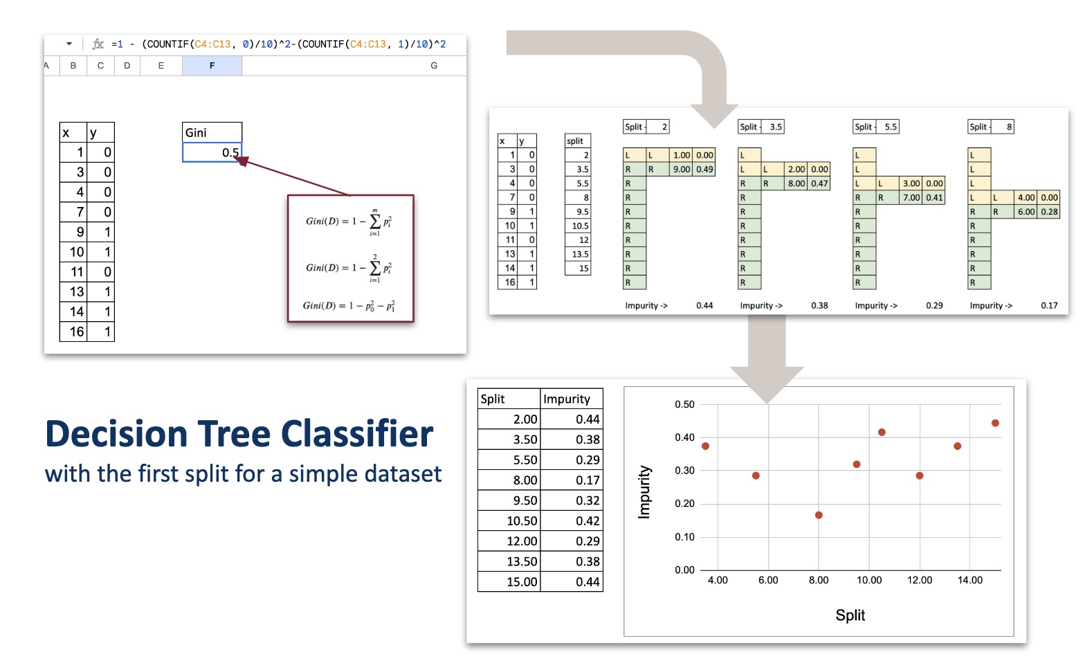
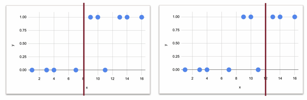
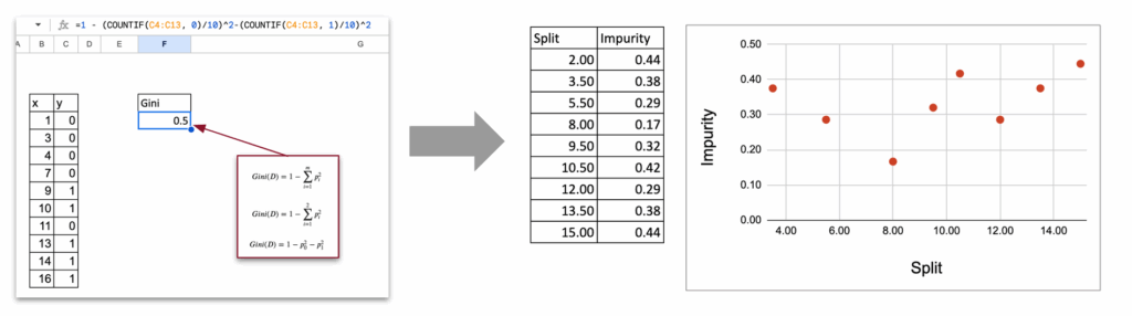
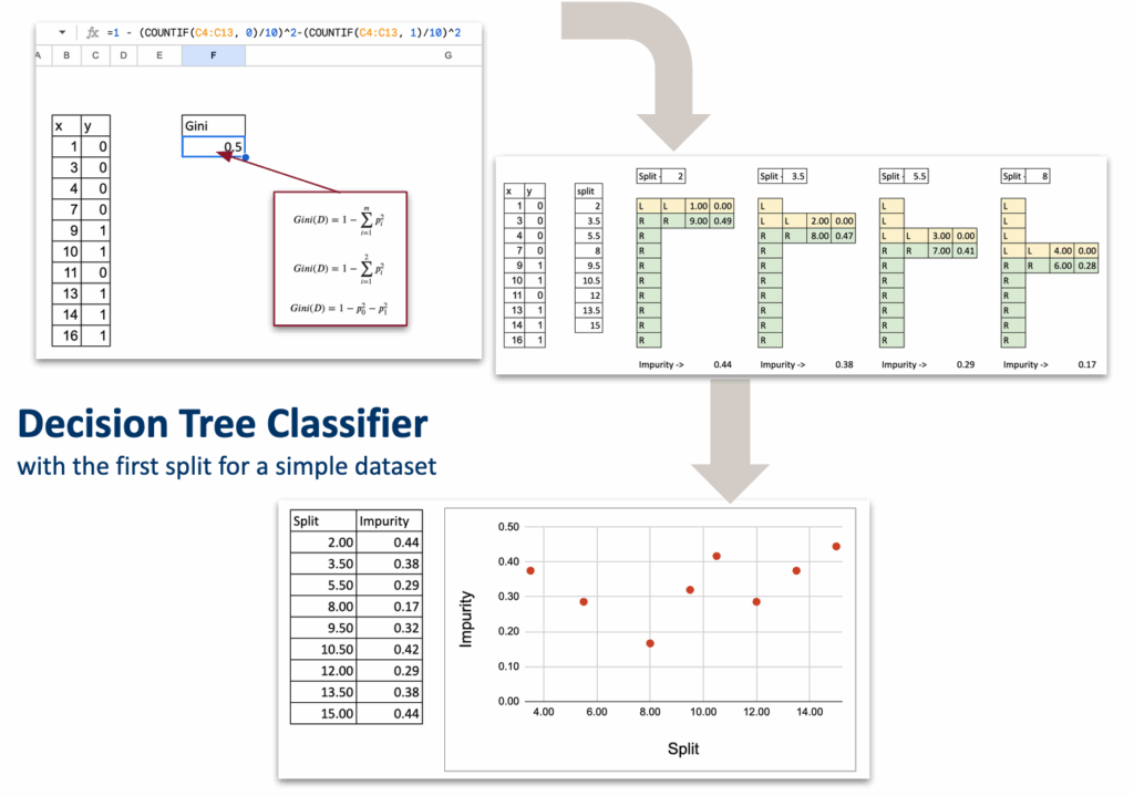
Let us begin with a very small toy dataset that I generated, with one numerical feature and one target variable with two classes: 0 and 1.
The idea is to cut the dataset into two parts, based on one rule. But the question is: what should this rule be? What is the criterion that tells us which split is better?
Now, even if we do not know the mathematics yet, we can already look at the data and guess possible split points.
And visually, it would 8 or 12, right?
But the question is which one is more suitable numerically.
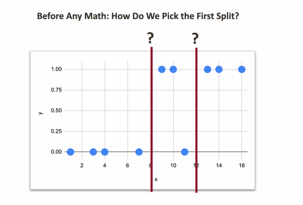
If we think intuitively:
- With a split at 8:
- left side: no misclassification
- right side: one misclassification
- With a split at 12:
- right side: no misclassification
- left side: two misclassifications
So clearly, the split at 8 feels better.
Now, let us look at an example with three classes. I added some more random data, and made 3 classes.
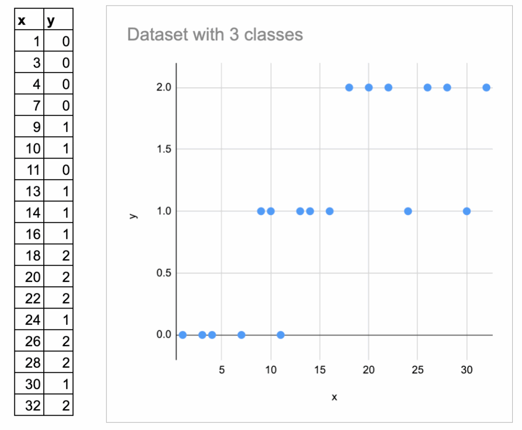
Here I label them 0, 1, 3, and I plot them vertically.
But we must be careful: these numbers are just category names, not numeric values. They should not be interpreted as “ordered”.
So the intuition is always: How homogeneous is each region after the split?
But it is harder to visually determine the best split.
Now, we need a mathematical way to express this idea.
This is exactly the topic of the next chapter.
Impurity measure as the criterion of split
In the Decision Tree Regressor, we already know:
- The prediction for a region is the average of the target.
- The quality of a split is measured by MSE.
In the Decision Tree Classifier:
- The prediction for a region is the majority class of the region.
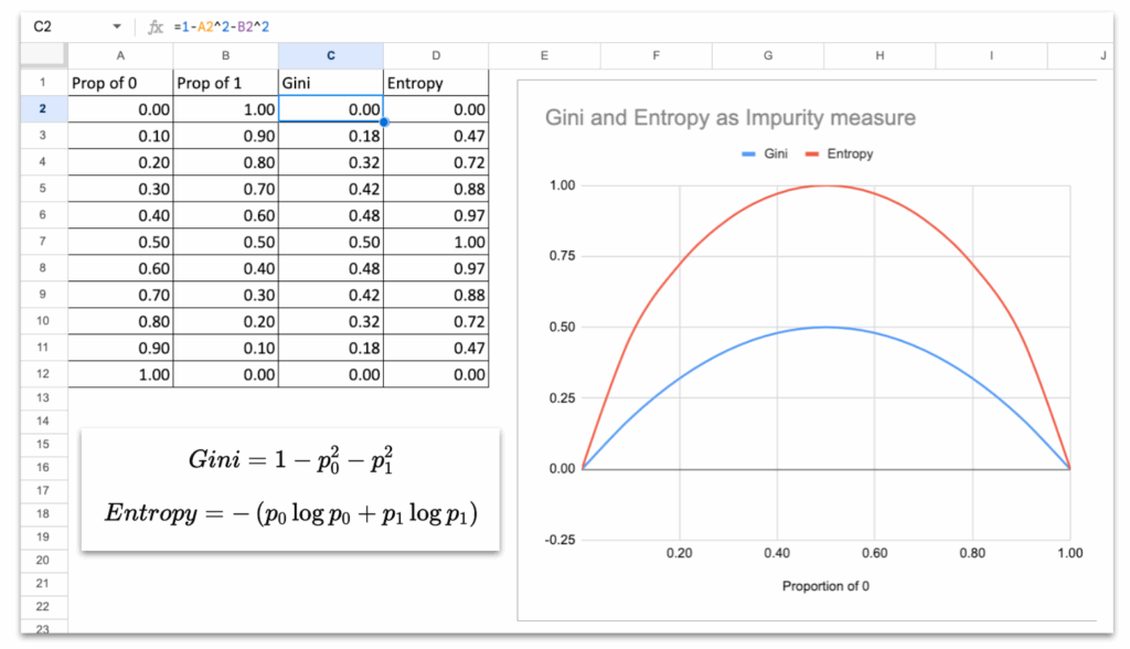
- The quality of a split is measured by an impurity measure: Gini impurity or Entropy.
Both are standard in textbooks, and both are available in scikit-learn. Gini is used by default.
BUT, what is this impurity measure, really?
If you look at the curves of Gini and Entropy, they both behave the same way:
- They are 0 when the node is pure (all samples have the same class).
- They reach their maximum when the classes are evenly mixed (50 percent / 50 percent).
- The curve is smooth, symmetric, and increases with disorder.
This is the essential property of any impurity measure:
Impurity is low when groups are clean, and high when groups are mixed.
So we will use these measures to decide which split to create.
Split with One Continuous Feature
Just like for the Decision Tree Regressor, we will follow the same structure.
List of all possible splits
Exactly like the regressor version, with one numerical feature, the only splits we need to test are the midpoints between consecutive sorted x values.
For each split, compute impurity on each side
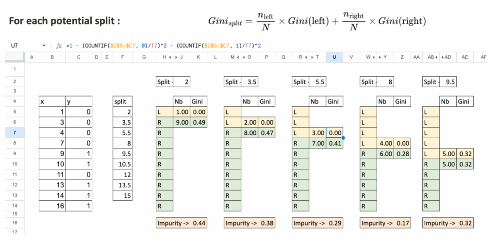
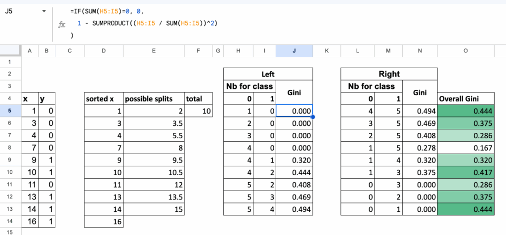
Let us take a split value, for example, x = 5.5.
We separate the dataset into two regions:
- Region L: x < 5.5
- Region R: x ≥ 5.5
For each region:
- We count the total number of observations
- We compute Gini impurity
- At last, we compute weighted impurity of the split
Select the split with the lowest impurity
Like in the regressor case:
- List all possible splits
- Compute impurity for each
- The optimal split is the one with the minimum impurity
Synthetic Table of All Splits
To make everything automatic in Excel,
we organize all calculations in one table, where:
- each row corresponds to one candidate split,
- for each row, we compute:
- Gini of the left region,
- Gini of the right region,
- and the overall weighted Gini of the split.
This table gives a clean, compact overview of every possible split,
and the best split is simply the one with the lowest value in the final column.
Multi-class classification
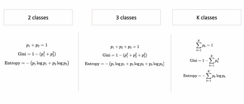
Until now, we worked with two classes. But the Gini impurity extends naturally to three classes, and the logic of the split stays exactly the same.
Nothing changes in the structure of the algorithm:
- we list all possible splits,
- we compute impurity on each side,
- we take the weighted average,
- we select the split with the lowest impurity.
Only the formula of the Gini impurity becomes slightly longer.
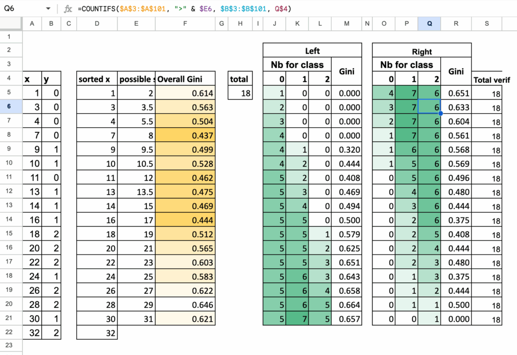
Gini impurity with three classes
If a region contains proportions p1, p2, p3
for the three classes, then the Gini impurity is:

The same idea as before:
a region is “pure” when one class dominates,
and the impurity becomes large when classes are mixed.
Left and Right regions
For each split:
- Region L contains some observations of classes 1, 2, and 3
- Region R contains the remaining observations
For each region:
- count how many points belong to each class
- compute the proportions p1,p2,p3
- compute the Gini impurity using the formula above
Everything is exactly the same as in the binary case, just with one more term.
Summary Table for 3-class splits
Just like before, we collect all computations in one table:
- each row is one possible split
- we count class 1, class 2, class 3 on the left
- we count class 1, class 2, class 3 on the right
- we compute Gini (Left), Gini (Right), and the weighted Gini
The split with the smallest weighted impurity is the one selected by the decision tree.
We can easily generalize the algorithm to K classes, using these following formulas to calculate Gini or Entropy
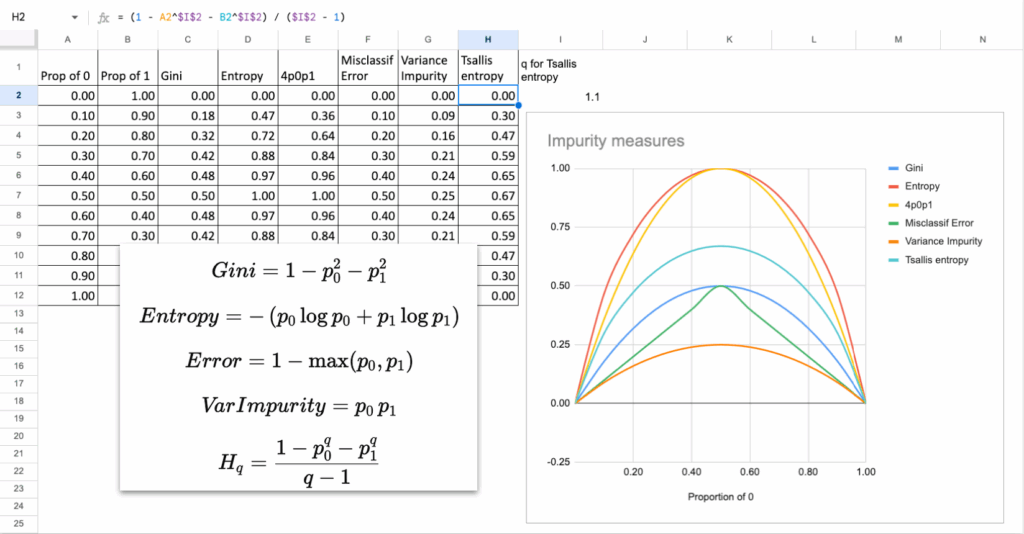
How Different Are Impurity Measures, Really?
Now, we always mention Gini or Entropy as criterion, but do they really differ? When looking at the mathematical formulas, some may say
The answer is not that much.
In theory, in almost all practical situations:
- Gini and Entropy choose the same split
- The tree structure is almost identical
- The predictions are the same
Why?
Because their curves look extremely similar.
They both peak at 50 percent mixing and drop to zero at purity.
The only difference is the shape of the curve:
- Gini is a quadratic function. It penalizes misclassification more linearly.
- Entropy is a logarithmic function, so it penalizes uncertainty a bit more strongly near 0.5.
But the difference is tiny, in practice, and you can do it in Excel!
Other impurity measures?
Another natural question: is it possible to invent/use other measures?
Yes, you could invent your own function, as long as:
- It is 0 when the node is pure
- It is maximal when classes are mixed
- It is smooth and strictly increasing in “disorder”
For example: Impurity = 4*p0*p1
This is another valid impurity measure. And it is actually equal to Gini multiplied by a constant when there are only two classes.
So again, it gives the same splits. If you are not convinced, you can
Here are some other measures that can also be used.
Exercises in Excel
Tests with other parameters and features
Once you build the first split, you can extend your file:
- Try Entropy instead of Gini
- Try adding categorical features
- Try building the next split
- Try changing max depth and observe under- and over-fitting
- Try creating a confusion matrix for predictions
These simple tests already give you a good intuition for how real decision trees behave.
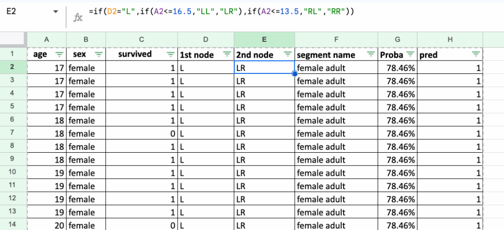
Implementations of the rules for Titanic Survival Dataset
A natural follow-up exercise is to recreate decision rules for the famous Titanic Survival Dataset (CC0 / Public Domain).
First, we can start with only two features: sex and age.
Implementing the rules in Excel is long and a bit tedious, but this is exactly the point: it makes you realize what decision rules really look like.
They are nothing more than a sequence of IF / ELSE statements, repeated again and again.
This is the true nature of a decision tree: simple rules, stacked on top of each other.
Conclusion
Implementing a Decision Tree Classifier in Excel is surprisingly accessible.
With a few formulas, you uncover the heart of the algorithm:
- list possible splits
- compute impurity
- choose the cleanest split
This simple mechanism is the foundation of more advanced ensemble models like Gradient Boosted Trees, which we will discuss later in this series.
And stay tuned for Day 8 tomorrow!